Role
User Research, Usability testing, Workshopping, Visual Design, Wire-framing, Prototyping
Team
Senior Product Designer
Product Manager
iOS, Android, and API Developers
TL;DR
As a mobile product designer, I enhanced the shift trading user flow and redesigned the UI to better complement the in-person experience and support the task decision-making process. Parts of my design process included conducting user research, synthesizing findings, wire-framing, usability testing, and iterating on visual design. At the end, I created a final prototype to present to stakeholders such as the PM, developers, and design leaders.

Overview of my design process for this project
What's Ceridian?
I joined Ceridian as a mobile product designer working on their flagship product Dayforce Mobile, a human capital management software that supports employees and employers through all workplace interactions such as payroll, benefits, and scheduling. Our clients are from various industries such as retail, restaurant, and construction.
The Problem
Our current shift trading feature serves more for functionality and to finalize a trade for manager visibility but doesn’t accurately reflect the user journey or task decision making process in real life. It lacks the tools to help capture that real life interaction and support decision-making in the digital space from home, beyond the store. There are also major usability issues and points of confusion.
The Solution
Employees are able to trade shifts in a sequence that follows their mental task model, starting with selecting who to trade with. As well, there is are clearer messaging and an optional note that can be added so that employees who are requesting a trade can better communicate their urgency to fellow employees.
⎯ ✾ ❀ ✽ ⎯
pHASE 1
Discover
Problem Framing
Human-level explanation
Imagine this scenario
It's Tuesday. You work at a retail store in the local mall and are scheduled to work Friday night. A family emergency comes up and you can’t fulfill that shift, so during your shift tonight, you go around asking coworkers informally if anyone can cover it. You find a coworker you're friendly with and they agree — what happens next?
Shift trading and bidding is a process that often happens on the floor, on the fly. Employees sometimes have urgent conflicts or want to work extra shifts and need some way to ensure the shift is covered. A shift is built up of two parts:
From past research, most shift trading happens informally during a shift or over social platforms to get in touch with coworkers.
Use cases
The Shift Trading feature adds interactions that allow employees to give their shifts to peers, exchange shifts with their peers, or request to work a currently unfilled shift.

3 different flavours of shift trading & bidding
Our current shift trading & bidding feature serves more for functionality and to finalize a trade for manager visibility but doesn’t accurately reflect the user journey or task decision making process in real life. It lacks the tools to help capture that real life interaction and support decision-making in the digital space.
To guide our design process:
How might we support employees with managing their shift schedule digitally, to improve usability and provide greater support their task decision-making on the go?
Goals
Product motivation & mobile-first mindset
This sub-feature lives within two of our most used features that are very stable and result in 1.4 million shift trades a year. There’s a huge difference between the amount of shift trading/bidding on mobile and web — majority of it is on mobile, and ~90% of those are iOS users.
We want to enhance the employee experience, and understand user motivation as to why they’re putting shifts up for bidding and what factors matter when trading/picking up shifts.

Goals set collaboratively by me, a senior designer, and the PM
Success metrics
What does success look like?
Working with the PM, we learned what defined what success looks like for this project. We want to create a flow that encourages more people to trade shifts digitally, sets employees up for success to complete trades, and for it all to occur on mobile.

Research
We started by conducting research to help us discover how we can enhance the experience for users and address some low points in their journey.
Goals
- Establish a general baseline of how users feel about the current shift trading and bidding experience
- Determine where users are struggling and areas to focus improvements
- Understand the user motivations behind trading and bidding shifts to determine how to enhance the experience
Audience
The majority of shift trades and bids occurs for clients in the Retail sector, so we mainly sourced retail employees for our interviews.
85.7% of shift trading occurs from retail employees
Phase 1: User Interviews
Shift decision making task models
For the first phase, we wanted to get general insights into how employees go about making decisions about their shift schedule. In collaboration with UX Researchers, they helped us gain clearer insights into decision-making and user motivations towards trading and picking up shifts.
Phase 2

Sequence of how employees make decisions on their shifts
Phase 2: Usability tests
Current experience with shift trading
For phase 2, we conducted tests with retail users to better understand their journey through the offer, swap and bid flows. We explored the present flow, devised tasks, prioritized them, and launched on Usertesting.com. Our audience consisted on non-Dayforce users to get a more neutral understanding across all shift workers and those who aren’t familiar with SAAS products.

Rough work of our usability test planning
⎯ ✾ ❀ ✽ ⎯
Phase 2
Define
Transforming feedback into insights
With all the raw feedback from users collected during both research phases, I conducted various exercises to synthesize the research, conclude key findings, and transform them into meaningful ideas to drive our designs.

The sticky note evolution of ideas (:
5-step definition
I transformed feedback into insights through a 5-step process, with collaborative workshops involving various partners.
Research Wrap up
So, what did we discover?
After taking our research and synthesizing the results, we’re able to define our solution space and focus on some main insights to guide our iterations.

⎯ ✾ ❀ ✽ ⎯
Phase 3
Design
Revisiting user flows
Before jumping into Figma, we revisited the current user flows and focused on:
Decision-making process
Readjusted the sequence of steps to closely reflect the shift decision task-model (based on Phase 1 findings)
User-experience
Added new screens, component, and messaging to lift low points in the journey (based on Phase 2 findings)

Wireframes in Figma
Then created wireframes for the new flows with a focus on illustrating the interactions and functions within and across screens.
✰ Aligning with Stakeholders
We reviewed wireframes with several stakeholders before proceeding to higher fidelity: Mobile Design Team, Product Partners (Mobile, Web), Developers (iOS, Android, API), Design Leadership, UX Researchers, Mobile Accessibility Specialist

Validating with users along the way
Using these wireframes, we did a quick usability test with users for sense check of if this direction is resulting in improvement.
87.5% of users made it through successfully
Received a lot of positive feedback, improvements to be made through clarity including naming conventions, messaging to users, and system notifications.
Challenge
Reducing cognitive load
Some employees don’t have a specific coworker in mind to trade with and are just browsing for any available person. There’s 2 decisions that need to be made at the start of the flow:
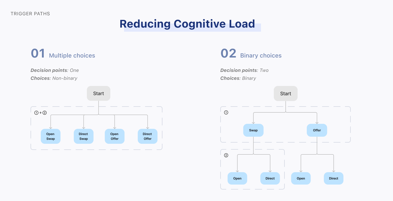
Two possible flows for the initial decisions
Challenge
We have 4 combinations of trades users can choose — how can we provide multiple options without overwhelming the user?
Solution
Option 2! Break down many choices into small sets of related, simple decisions that are made in sequence.
Result
By creating sets of binary decisions, it simplifies decision-making effort into more manageable chunks, reducing the user’s cognitive load at the start of the flow.
Challenge
Communicating to users
A major pain point was the confusion users had with what they can accomplish at each step.
3 important things we needed to communicate:
actions, decisions, and progress
In an early iteration, we put a lot of weight in the top nav bar to communicate actions to users. There were a lot of edge cases and we could find opportunities have the message closer grouped to the actual actions. We also renamed page titles to focus on communicating progress and wayfinding, and less about instruction. Actions and decisions were embedded at the top of the page to guide the users through this screen. Our final design was number 3.

Comparison of 3 iterations with different ways of visual communication - we chose #3!
Iteration
Exploring & evaluating different UIs
An important step is for the user to choose an employee, which can be done in several ways.
Search for an employee (i.e. look up their name)
Choose the anyone option (i.e. trade with anyone)
Select from suggested options (i.e. choose from visible options)
We had 3 different versions of how we can communicate 3 distinct choices:

Comparison of different iterations of the 'Search Employee' page - we chose #3!
01. Connected

“Anyone” option divides the Search options
Search feels like it applies to employee options and “Anyone”

Doesn’t feel like 3 distinct options
02. Separated
Disconnected options
Feels like an overwhelming number of different options
“Anyone” option is prioritized below specific employee
03. Grouped
Search bar not as defined
Hierarchy of options reflects user needs priority
2 distinct options
Ensuring accessibility
With mid-fi screens, we had a quick consult with our mobile accessibility specialist to get an idea of how accessible our design is with a focus on employees that use screen readers.
Important things to keep in mind:
Ensure consistent headings → enables users to skip through the screen quickly
Maintaining linear display is good for screen readers
Any component that’s focusable needs to have sufficient context for interaction
Optimize designs for resizing text on different screens
⎯ ✾ ❀ ✽ ⎯
fINAL dESIGN
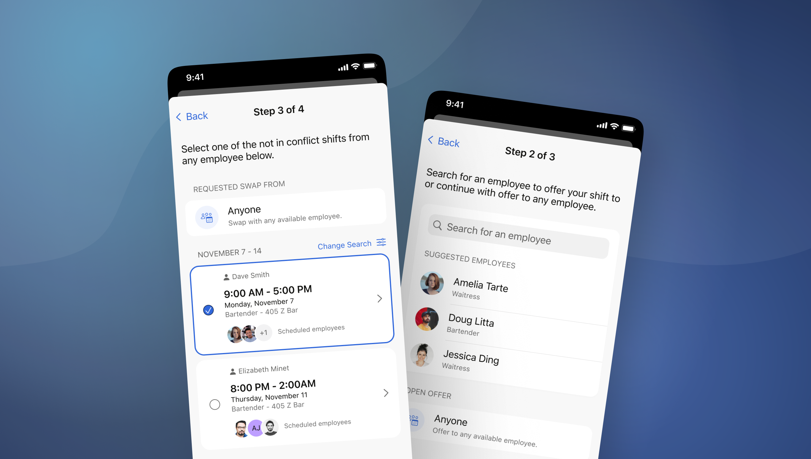
Introducing the redefined shift trading experience on mobile,
Find the complete Figma prototype
here.Flexibility with shift schedule
First, you can select a partial or full shift to offer or swap. By default, the full shift will be selected but users are given the flexibility to adjust based on their conflicts.
Finding someone to cover your shift
Employees now have a clearer option to create an open trade to anyone, or specify someone to trade with. In the second, they’re presented with an option to search as well as recommendations based on team, past trades, and availability.
Apply filters to narrow your search
Users can further adjust their search by adding specific criteria such as time and location. This helps them make quicker decisions among a smaller pool of possible trades.
Select a shift and add an optional comment
For swaps, employees have the necessary information to make a decision on which shift they want to swap shifts. They can view scheduled coworkers, shift time, date, and know exactly who they’re requesting a shift from.
Next steps and status
Now users are given feedback after submitting a request so they know what happened and what to expect. They can view the state of their trade as well as the dependent parties involved.
⎯ ✾ ❀ ✽ ⎯
Key tAKEAWAYS
Reflecting back on the process,
What did I learn?
The small, medium, and large t-shirt sizes
It’s helpful to also think about how a flow can be adopted into larger features, or maybe scaled into a standalone one. Consider the small, medium, and large t-shirt sizes to adjust accordingly based on product vision & technical feasibility!
Designing for iOS and Android
The two systems have different components systems, behaviours, and guidelines. It was important to keep in mind how a design could be adapted to any particular device and be flexible with different systems of UI patterns.
Conducting effective UX Research
It’s important to establish goals and methodology in a research plan so that when synthesizing the findings, you can tie it back to the purpose. As well, asking the right questions is more important that asking many questions — want users to give genuine responses to unbiased questions.
World of workshopping
Workshops are a great way to ideate but it's important to avoid coming into workshops solutioning as it can create bias in the outcome. As well, I learned a lot about how to structure, lead, and facilitate these workshops so that I can maximize discussion and collaboration!